
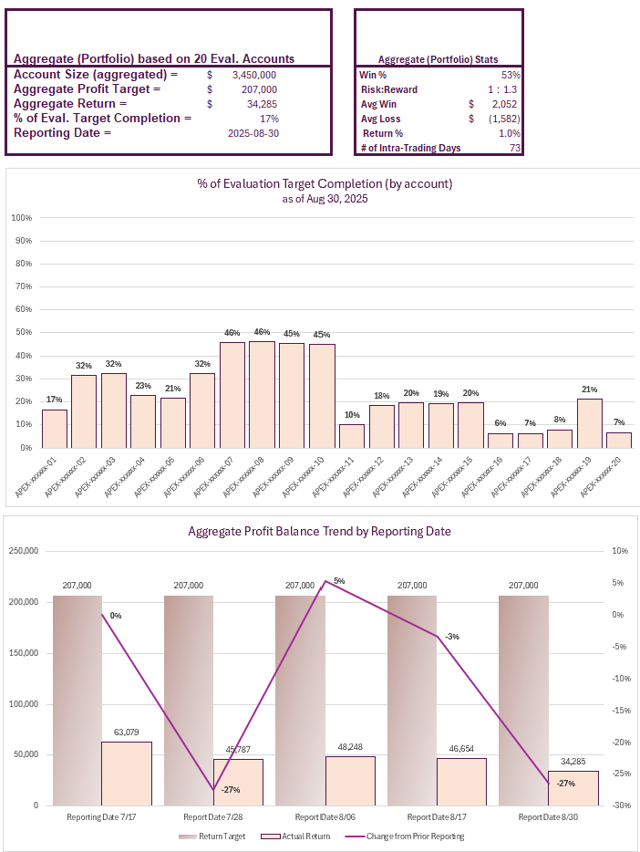
Progress as of 08-30-25
This time, I’m using graphs/charts to summarize my reporting. Since I like to trade and manage my 20 evaluation accounts as a portfolio, the performance of the 20 accounts is treated as one big portfolio. The first group of graphs is my summarization based on Apex’s performance dashboard for my accounts (last screenshot at the bottom) as of this reporting date. I hope this is clearer and makes sense.
So far, I am still in the green across all 20 accounts, but I did lose about 12k of my total profits from the last reporting date.
Below is a screenshot of my Apex Trader Funding Evaluation Accounts on Apex’s platform as of August 30, 2025 (of which the above summarization is based on):
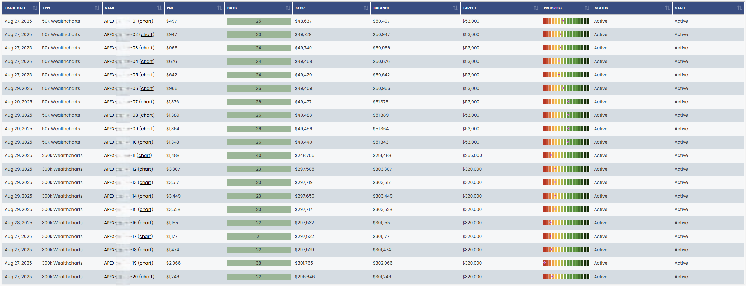
Note: This is a direct screenshot from my Apex Dashboard. My Apex account numbers have been blurred out for security purposes. (To understand how to read these charts, refer to Apex’s explanation on their website.)